


tighegd@lopers.unk.edu
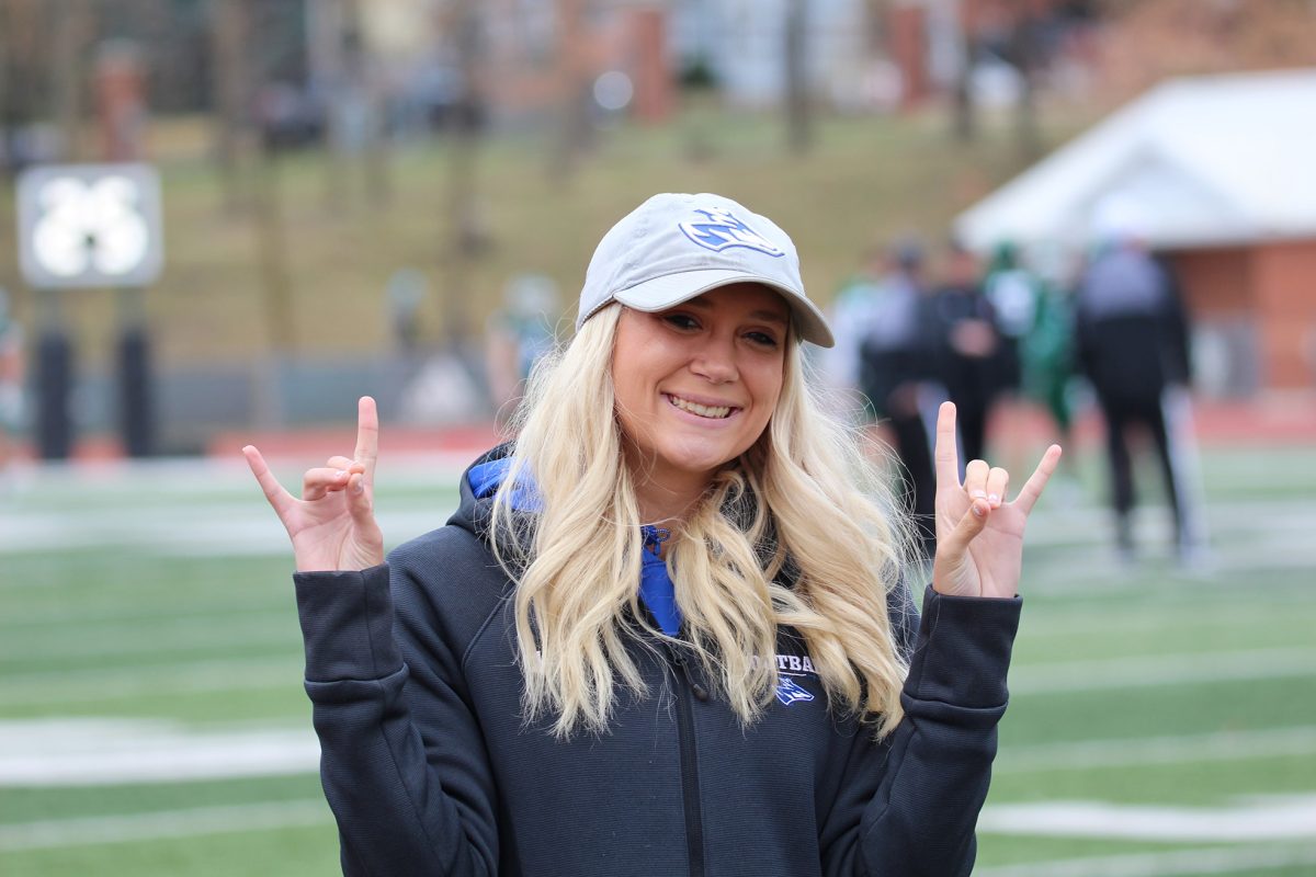
There are multiple variations of sporting uniforms that UNK athletic teams wear. The blue, gold, black and white Loper combinations all provide for some unique and flashy uniforms.
Some of these uniforms work, some of them don’t.
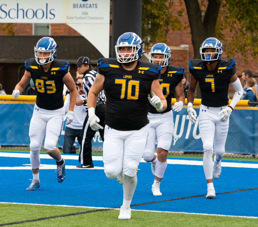
Football
The Loper football team uses the most combinations of any team at the school. It makes it fun and unique to see what style they will wear any given week.
The best look is the blue helmet, blue uniform and white pants combo. It’s the cleanest and simplest look that is rooted in the tradition of the program. I would also be in favor of making the numbers white with a yellow outline just to keep everything matching.
They fall victim, just like most other Loper teams, to the BFBS (black for black sake) uniforms. I personally don’t love these uniforms mainly because they don’t match the helmets. Even something as small as a black Loper decal would make these look cleaner, despite still having the white facemask.
The new antler decals last year were cool, but the team wore them too much. They needed to just wear them for a game or two then ditch them. The decals haven’t made an appearance this season.
Soccer
The UNK women’s soccer team might have the worst uniform combination of any sporting team with their white jerseys with yellow numbers. The numbers are unreadable from afar and make it hard to recognize the players on such a huge field.
As a journalist and statistician, it is almost impossible to figure out what players are on the field at any given moment. If somebody who regularly covers the team can’t recognize the players on the field, then how would the average fan be able to? We want to give the athletes recognition and having readable numbers is the best way to do this.
A blue outline might not fix the problem entirely, but it would definitely make it easier. You just can’t have the yellow-on-white combinations. It doesn’t work.
Soccer also has all blue and all-black uniforms. These are easily readable and are a good look for the team.
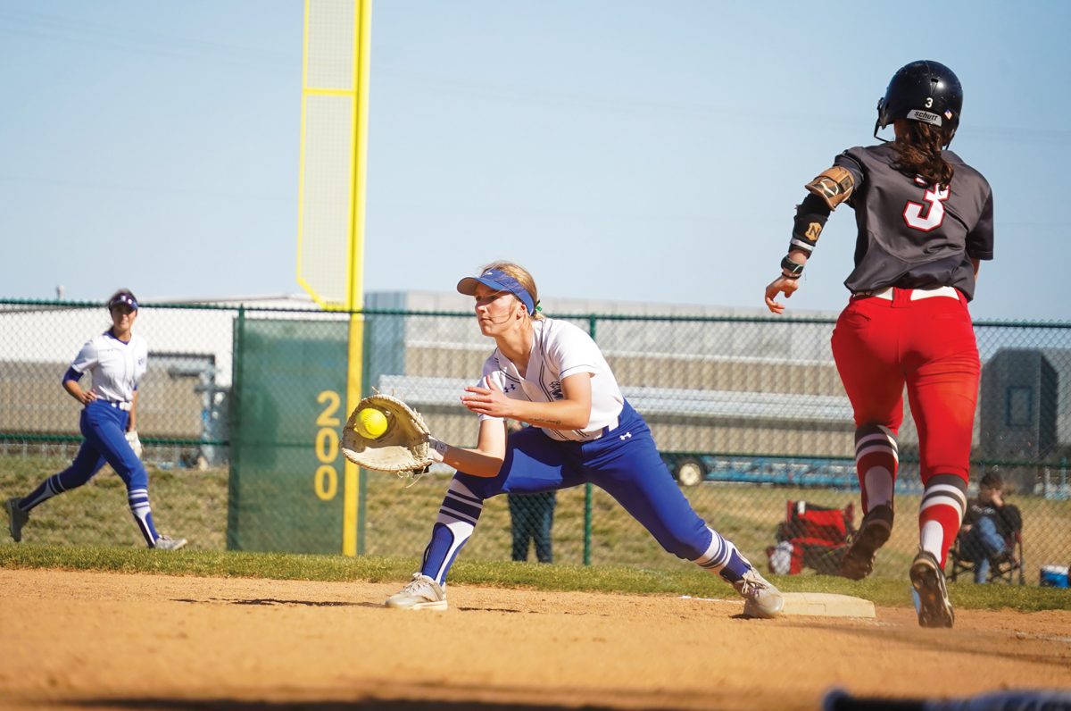
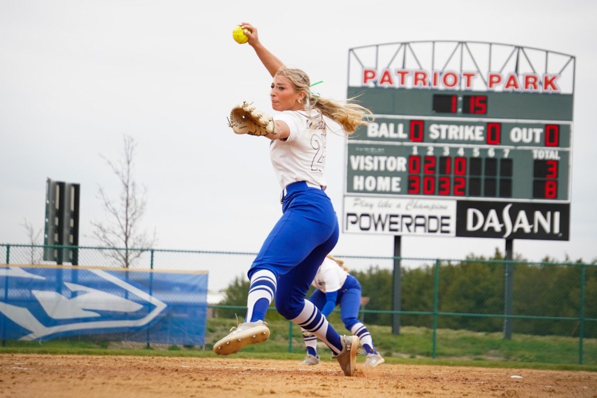
Softball
They fall into the same category as soccer, except their worst uniforms are white with just gray outlines for the numbers. They are unreadable and make it hard for anyone working the game in the press box to do their job.
This also isn’t the biggest issue since in softball you usually know where everybody is playing on the field. It can still be annoying with substitutions and various other situations.
Others
Volleyball and basketball have some of the best uniform combinations. Volleyball has a great mix of blue, black and white with easily seen numbers.
Both basketball teams have nice school-colored uniform combinations. The men’s team does fall into the BFBS category with one of their away uniforms, but it is a nice and matching look with black shorts and white numbers. The women’s basketball team also got nice, new yellow uniforms that they’ll wear for this upcoming season.
Uniforms are a thing that will continually evolve and constantly be tweaked. Just make sure the design doesn’t compromise the purpose, which is recognizing the team’s brand and athletes.