It’s the first day of your freshman year at UNK, and you have an 8 a.m. class in MC 150.
You scroll through the online catalog to see what MC stands for. It’s not there.
You check the official UNK campus map to see where the MC building is. It’s not there.
You walk around campus, looking for an MC sign on the building’s exterior. It’s not there.
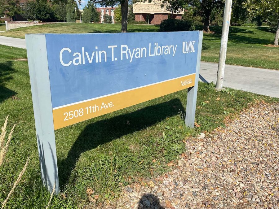
Finally, you ask a student passing by who informs you the Mitchell Center is inside the Calvin T. Ryan Library on the south side.
UNK needs to upgrade campus signage, so visitors and new students can navigate through campus easier.
First-year students familiarize themselves with the campus as the school year progresses, but the lack of direction can be jarring to families arriving for campus visits. Prospective students and their parents will experience less stress with access to abbreviation descriptions and locations ahead of time.
During tours of UNK, two hours is not enough time for campus visit assistants to mention all of the offices, departments or majors that are associated with each building.
Students will miss out on resources, and departments will miss out on talent if their existence is not made known.
The current, rectangular signs are faded and nonspecific.
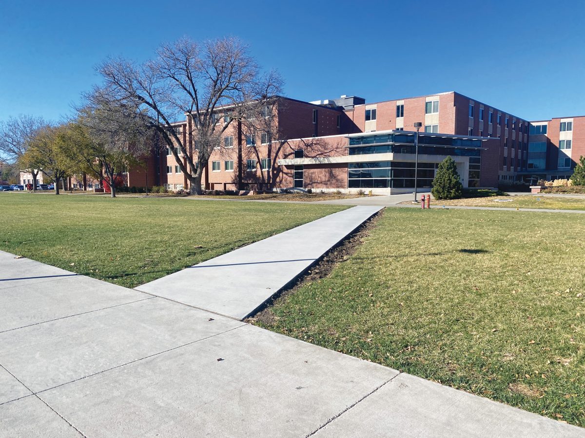
The criminal justice department, the Registrar’s Office and the English department are buried within buildings titled Copeland Hall, Warner Hall and Thomas Hall — names with no indication of the resources or classes within.
Consistency is also a serious problem.
Clusters of random signage surround the Memorial Student Affairs Building in an effort to direct passersby to Student Health and the Academic Advising and Career Development Offices. Last year, UNK Admissions taped up a string of signs in the Nebraskan Student Union to direct campus visitors to the welcome desk for tours.
Like the Whos on Horton’s clover, the offices from within MSAB are yelling, “We are here. We are here. We are here.”
Navigational signs with arrows are needed so people can get from point A to point B, C, D and all alphabetic points. One sign with a map on the outskirts of east campus is not enough to point people in the right direction.
The solution is already on UNK’s campus by Martin Hall, though it is mostly covered by shade and construction fences right now.
This summer, a rectangular, broad-faced NSU sign was upgraded. Below the building’s title is a list that includes the Antelope Bookstore, food services, Campus Visit Check-In and an ATM. If an ATM deserves labeling, so does the rest of campus.
UNK Marketing and Facilities need to team up to replicate this labeling method for all buildings on campus.
It’s up to the students to show pride too, including the jokester who stuck googly eyes over the Nester South and NSU Os.
Consistent blue and gold branding will show others why Lopers are proud to call UNK home. We’re blue. We’re gold. Now it’s time to be bolder.


